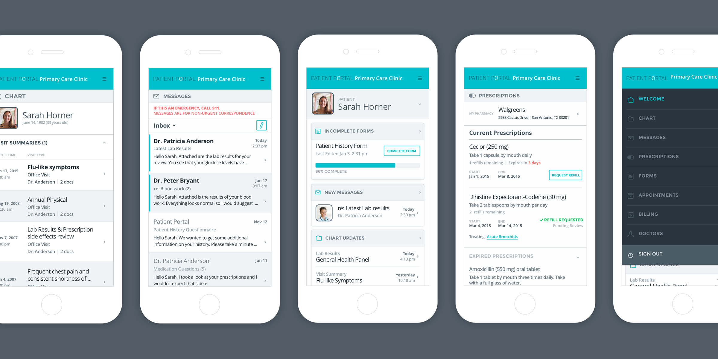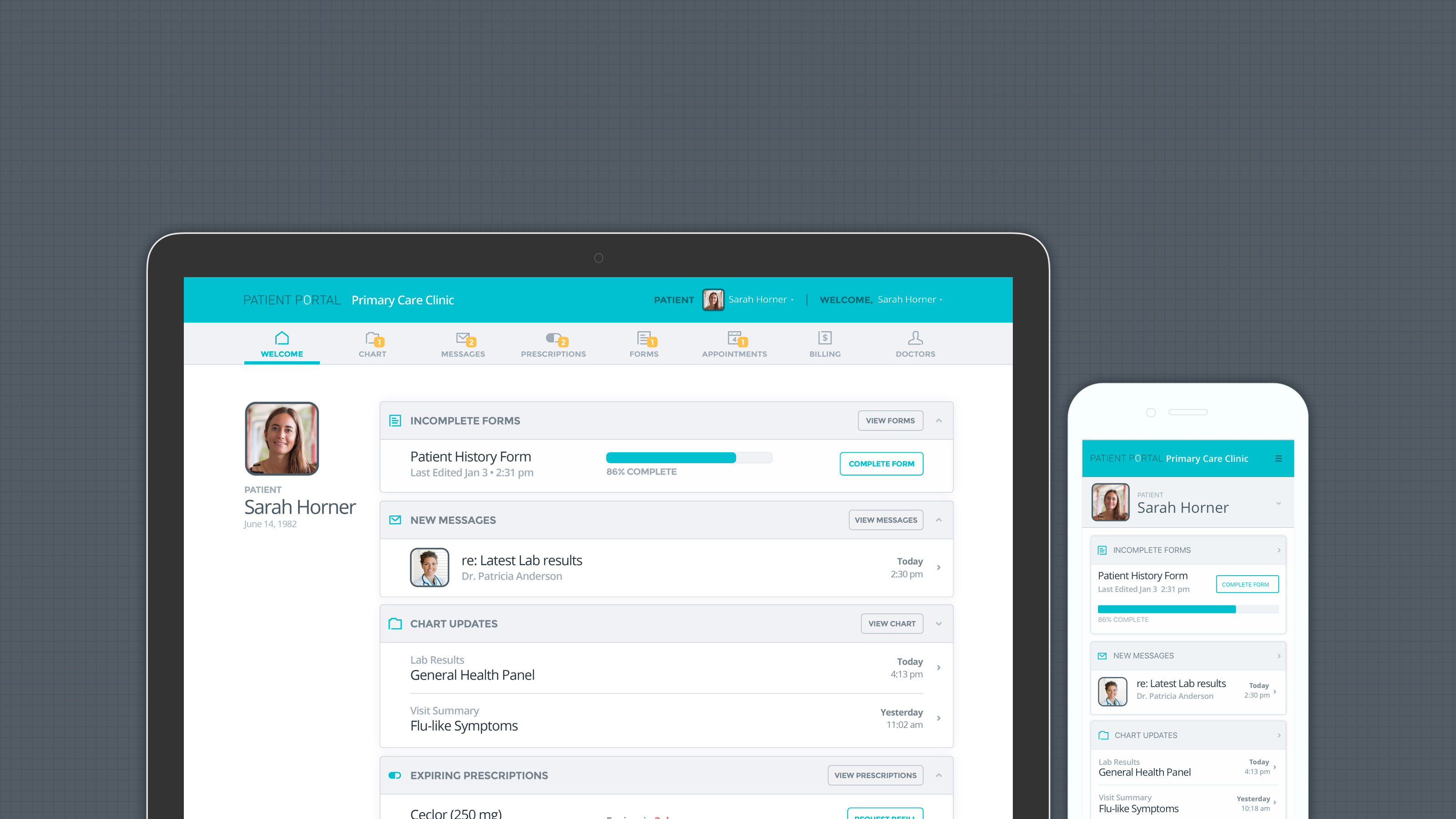

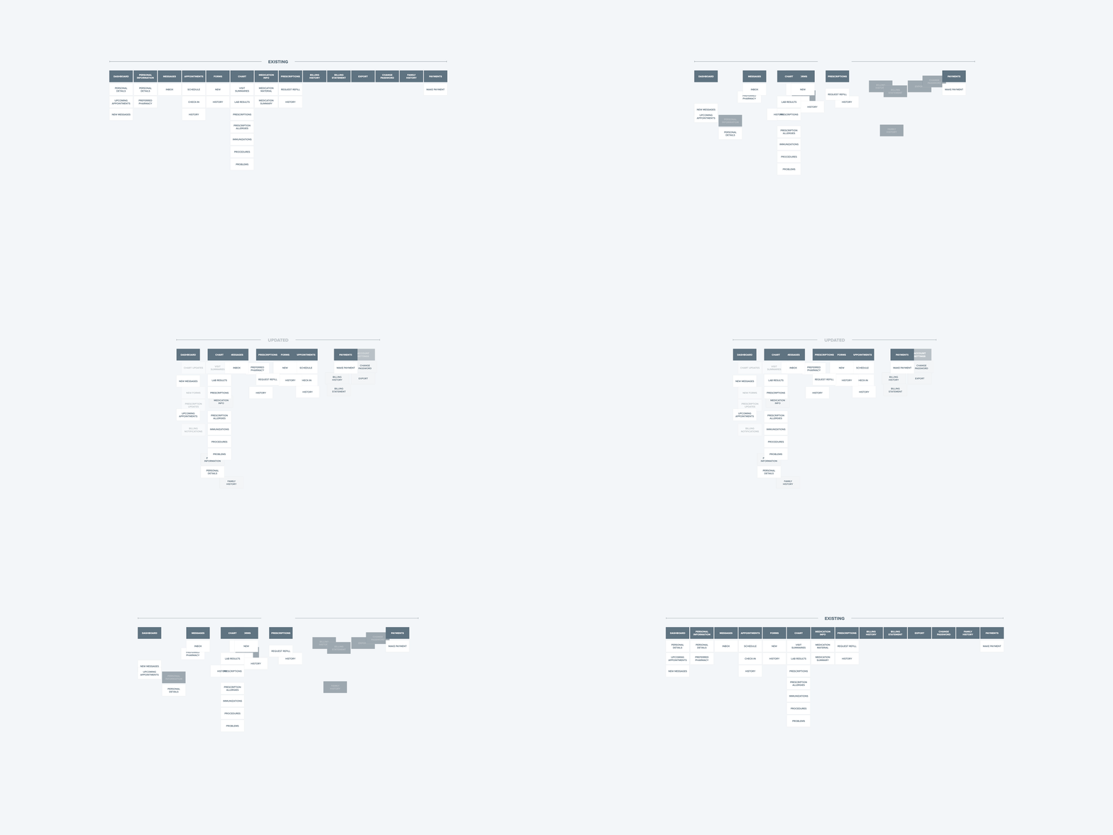
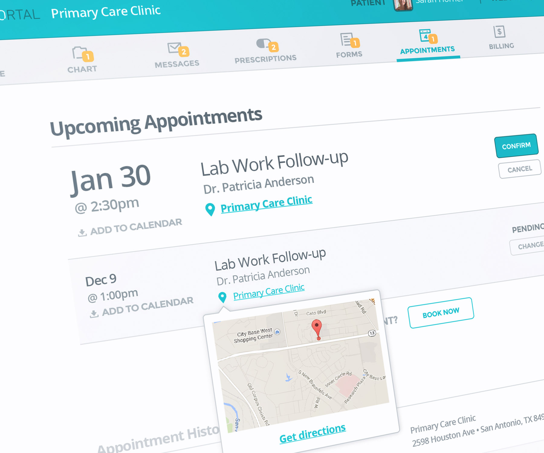
After a thorough audit, we completely restructured the site, grouping similar actions and information together to make the navigation more intuitive.
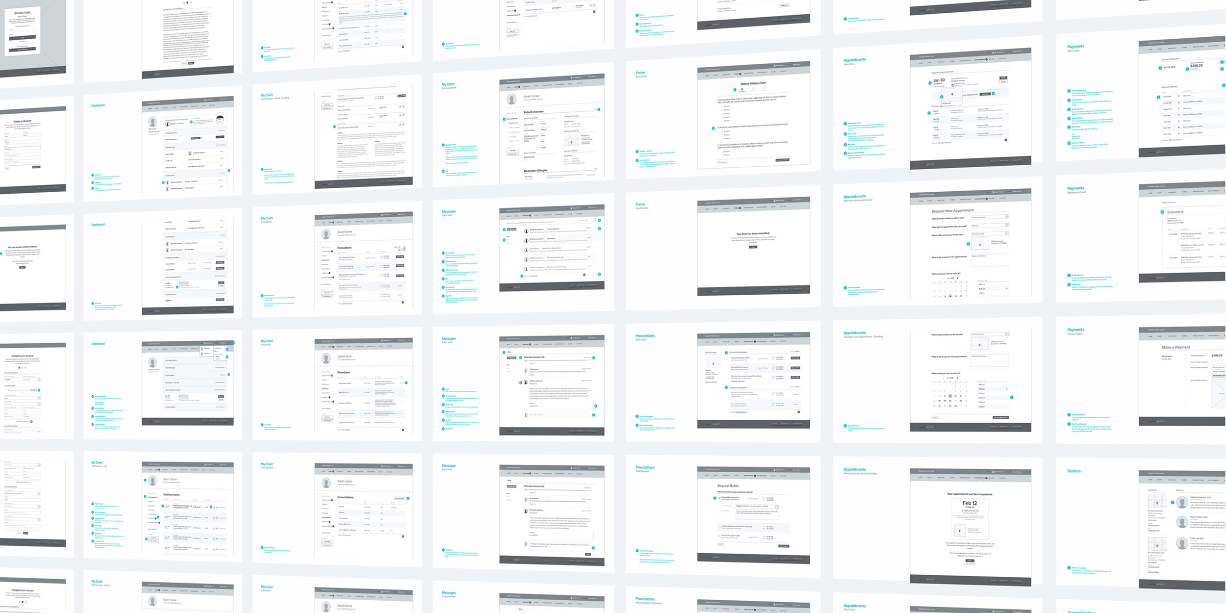
Detailed wireframes were built to account for all features and functionality. Because of the size of the platform, similar layouts were implemented whenever possible, providing familiarity as users navigate from page to page.
The colors and fonts were revised and icons and buttons were introduced, allowing the platform to take on a fresh feel.
When displaying such dense information, we carefully considered the size of all elements to make sure it wouldn't be difficult to view, since the audience would include a variety of ages.

The mobile site was developed in tandem with the desktop version, to ensure a unified experience across devices. With the exception of a few adjustments to better suit a smaller screen, a user can go from desktop to mobile seamlessly.
